
Thursday, May 29, 2014
Journal
Artists develop art making skills
In this project I learned how to use the gel medium to glue down the tissue paper. I learned that you have to put the glue down on the paper first and then out the tissue paper on and then put glue ontop of the tissue paper. I learned how to make a lot of layers and use different materials.
Artist reflect
After I glued down the tissue paper and the magazines I thought I was done. I felt like something was missing and it looked like it needed something else. So I added quotes and watercolor to add more layers.
Landscape
Artists take risks
In our landscape project my group took risks by trying a new technique of throwing the paint on the tree. We felt by doing this it added more to the tree instead of just the paint. We also took a risk by blending the different colors to get an ombré affect.
Artists collaborate
We had a group of three in our landscape project. Each of us had different idea on how to paint the tree. We wanted to do more than just painting the tree to make it look more unique. At first we were going to do tribal designs on the tree but then decided not to. We thought it would look better if we just splatter paint on it.
Wednesday, May 28, 2014
Sculpture
Artists develop art making skills


In pervious art classes I have made 3-D art sculptures but I have never made clay tiles. So making clay tiles was a new technique for me. I stuggled with making the objects pop out on the tile. I learned tequniques for adding clay to the piece by scoring and then adding water so the clay would stick together. Another technique I learned was smoothing the clay out so it didn't make lines that I didn't end up with random lines. I defindently need to improve some, but I thought for my first time doing clay tiles they turned out pretty good!
Artist take risks
I took lots of risk in this project since I have never worked with clay tiles. Using the wire to connect the tiles was also new to me. It was hard to get the wire to stay and even with other small tile. 
Thursday, May 8, 2014
Shibori Dyeing
Laura Hunter
Laura Hunter has been working for twenty years making silk scarves and shawls using shibori techniques. She is from Olympia, Washington and has a BFA in Fiber Art from the University of Washington. She is self-employed and works in her home studio.

Laura's style techniques is using repetition and evidence of change.She likes using nature as a theme, like sand on the beach, ripples in the sand, and repetition on animals. Laura uses a technique called "itajime shibori" where the designs are created by dyeing the fabric while it is folded and clamped between tiles.. Each article of clothing is individually dyed, either before or after construction. Laura's work is more retail designed because she sells her scarves and shawls in stores around the United States. I picked this artist because I liked how she used the shibori techniques into something that is fashionable and wearable. I also like how she sews and gathers the fabric to give it more detail. Another thing I like about her art work is that all of her scarves and shawls are different; not just the color but also the patterns.

Wednesday, May 7, 2014
Perspective

Artists Communicate Through Their Work
In my painting I painted the TD Garden which is where the Boston Bruins play. I have a lot of family that lives in the New England area and visit a lot. My dad and me always go to one home game in Boston every year. My painting represents where I grew up watching the bruins play with my dad. It's a special place for me because it's something I will always share with my dad. This artwork intends to say that I like to watch hockey and I love the city of Boston.
Artists Develop Art Making Skills
In this project I learned how to do two-point perspective. Although I have done perspective drawings before, I never got it right. The warm-ups we did in class helped me with the techniques of drawing one point, two point, and three point perspective drawings. I also learned that using tape helps make really straight lines. Since there are so many tiny details in my painting I learned how to use paint to make these details look sharp.


Thursday, April 17, 2014
Art History
Art History
The piece my group had was "A Sunday on La Grande Jatte" by Seurat. The medium of the piece is pigment and is composed entirely of dots of pure color. It took Seurat two years to complete the painting. "A Sunday on La Grande Jatte" was in the Post- Impressionism movement. This movement happened in the 19th century and included French artists. The paintings in this movement seemed unplanned and the artists wanted the paintings to be more substantial.
Working on this project each person in my group was assigned to different tasks. Joanna was in charge of making one of the props, which was a lady. Tori was in charge of making another prop, which was the red hat lady. Chelsea and I made the black dog. And I did the PowerPoint for the presentation.
If I were to do this project again I would add more props so people could get a better understanding of the painting.

Friday, April 11, 2014

Wednesday, April 9, 2014
Portrait
Portrait
 |
| Original Picture |
Artists develop art making skills
The portrait project was the first project that I used paint as the medium in this class. The hardest part I had on this project was the hand because it was on top of her shoulder and blended in. It was hard to draw something on top of another thing, but I learned that using a different shade of paint for the hand made the hand stand out. Another technique that I learned was creating shadows with paint. Before in middle school I would just paint one color for the skin tone; this time I used different colors that were skin tone, but some dark and lighter versions to create shadows. I gained skills in creating a mix of different shades some light and dark so the portrait looked more realistic.
Artists Collaborate
While working on the portrait I asked for a lot of peoples opinions to see what they thought would look best. I wasn't sure what color I wanted the anchors to be in the background, so I asked someone. They said to do a light blue to make the portrait stand out more. The anchors turned out really good, by using a light blue because it made the portrait stand out than if I had used a different color. I was also having a hard time mixing colors to turn out the way I wanted them to. One person showed me a really technique of mixing the colors and having them be lighter and darker to make a shadow. I think I definitely improved my skills by asking people around me to see what worked for them and their opinions on different things.

 |
| Sketch |

 |
| Final Product |
Friday, March 28, 2014
Ipad drawing

I used layers by having three different layers. The first layer was the background of the drawing, the second was the drawing that I sketched and the last layer was the coloring of Olaf.
Friday, March 14, 2014
GIF
GIF

I did an elephant as my GIF because elephants are my favorite animal. An elephant has always been my good luck charm since I was little. I have an elephant charm on my bracelet to give me luck.
Printmaking
Printmaking
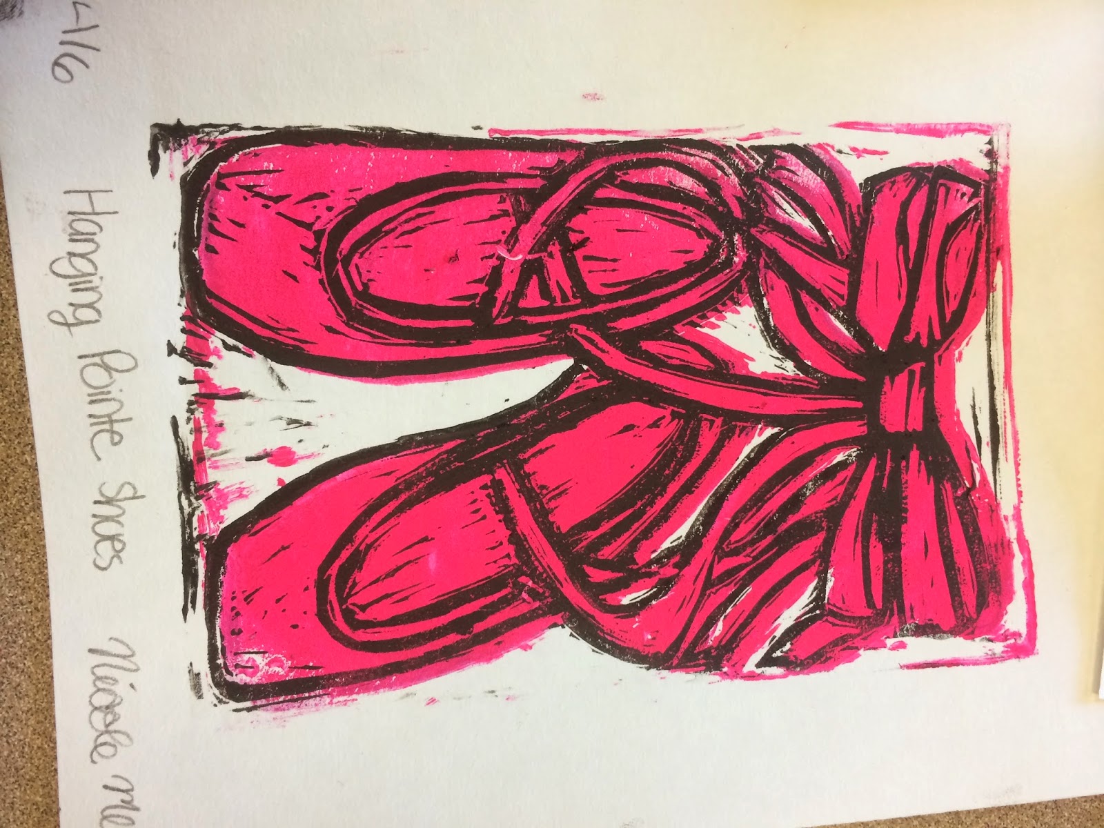
After I finished carving the places that I wanted to have pink, I printed it on a page. I saw some spots on the print that I didn't want have there. So I went back and carved out some more and then reprinted. I also noticed that I needed to add more ink so that it the print would come out better. When I was doing my second color of the black ink I notice that something was wrong when I printed it. It came out really blotchy and wasn't sure if it was become I used to much ink. I decided to change the ink that I used and it turned out a lot better. Before I put the new black ink on the print I tested out it out on scrap piece of paper to see if it would turn out how I wanted it to.
Artists Communicate Trough their Work-
For my art piece I did hanging pointe shoes. I chose this because I have been doing dance since I was three years old and wanted to make something that meant something to me. As of sixth grade I started doing pointe and I really enjoyed it, even though it can cause my feet pain! My art work is intended to show about me and show how dance has been an important factor of my life. I chose pink as the color because it is my favorite color. The issues that am examining through my artwork is to show that even though something that can be painful can be beautiful. My artwork also says that by practicing and doing what you love to do can turn out into a beautiful dance. And that all the hard work and painful practices is worth it.


Monday, March 3, 2014
Origami
5. During this project I asked others for advice on how to fold origami and what worked for them. I had some trouble with gluing down the big flower. I asked others advice on how I should glue it down so that it would stay. People at my table taught me new methods on how to fold and have me advice.


7. After I glued down everything I stepped back and felt that it needed something. I ended up painting the roses to give the project some color.
Tuesday, February 25, 2014
Color Project
 |
| Sketch |
At first I had trouble deciding on what theme I wanted and what medium I wanted. At first I was going to do a hot air balloon which would incorporate the theme explore. But after thinking about it I decided I wanted to do something that I actually liked. I chose to do a turtle because it is my favorite sea creature; which falls under the theme of creature. I have incorporated this theme by doing an underwater sea creature.
After figuring out what I wanted to draw I was not sure on what medium I wanted to do. At first I wanted to do the turtle rainbow with watercolor on its shell. When I finished sketching it in my sketch book I really didn't like the way it turned out. So instead I decided to use oil pastel for the turtle's shell. On the feet and head I did watercolor with oil pastel on top. I chose to do this so that the oil pastel stood out on top of the watercolor. For the background of the painting I chose to do an ombre of blue, starting from the top corner with a very light blue and going to the bottom corner with a dark almost black blue.
 |
The difficulties I have had so far are making the ombre in the background so that it is a smooth transition to light blue to dark blue. I also had difficulties with the head and making it to look realistic.
I think my piece was successful because I incorporated the theme of using a turtle as a creature. The areas that I am most proud of are the shell and the head. I liked the shell because I used different shades of red, yellow, and orange to color in the different shapes that made up the shell. I am post proud of the head because of mixing watercolor and the oil pastel it made the head look realistic.
If I could go back and change one thing it would be to draw lighter so that the pencil didn't show around the shapes of the turtle's shell.
From this project I learned that if you put watercolor first and then go back over with oil pastel it makes the object stand out more.
 |
| Finished Turtle |
Tuesday, February 4, 2014
Two in One project
In the two in one project I am morphing together a sunflower and a pocket watch. I incorporated the theme of the two in one project by morphing two different things into one. I chose to morph these two items together because I like sunflowers and I think a sunflower and a pocket watch would look cool together. The shape of my drawing is a circle because of the clock. The pocket watch chain is a vine with leaves on it to incorporate the sunflower.

The material I am using is pencil for the project because in my opinion pencil is easier to fix mistakes. Since this is my first project I wanted to use pencil because I have more experience using pencil in drawing. I don't like using charcoal because it is messy and it smudges my paper. I didn't want to use pen because it would be easy to make a mistake and you couldn't be able to erase your mistake.
The difficulties that I have encountered so far are choosing the right pencil medium for the clock. It is hard to find where the dark and light shading would be on a clock. Another difficulty that I have encountered is making sure everything is balanced and centered on the page.
I think the piece was successful because I chose a material that I was comfortable working with and I followed the directions of the assignment. I am most proud of the flower because I thought I shaded it good and liked the way it turned out.
If I could go back and change one thing I would make sure the lines were more straight and the circle was even.
I learned from this project that I have some capability of actually drawing and it not turning out like a little kid drew it. I also learned that I like to have an exact idea of what I want to draw before putting it onto the final draft.
 |
| Final Draft |
Subscribe to:
Posts (Atom)